Thursday, 26 December 2013

Wednesday, 25 December 2013


Tuesday, 24 December 2013

Friday, 6 December 2013


Sunday, 1 December 2013

Wednesday, 20 November 2013


Tuesday, 19 November 2013


Monday, 18 November 2013

Saturday, 16 November 2013
Aid and Abet, Tom Dale and Zero is Immense
Going to Aid and Abet, located in Station Road, Cambridge, is a nerve wracking process. It's the titles you see, like the one for Tom Dale's solo show. Zero is Immense. Maybe it is just a big hole in the gallery. Or perhaps the vast light year spanning mystery of the universe laid out before us.
I sat in a pub called The Flying Pig in order to ponder the problem of the name. Catchy, I thought, but maybe also a tad incorrect. Zero is infinite. Anyway, that is neither here nor there. Leaving the pub I attempted to cross the road. This was such a risky undertaking (and undertaking was on my mind at the time, believe me) that I thought that the pub should be renamed The Flying Corpse.
Anyway, I got to Aid and Abet pretty quickly, and having left the dog and my white cane outside, I ventured within. Luckily there was something to drink. And it was £2 a pop. Alcoholic drinks were also £2 a pop. This word "pop" is probably quite a useful one to keep in mind, just vaguely, not in capital letters or anything.
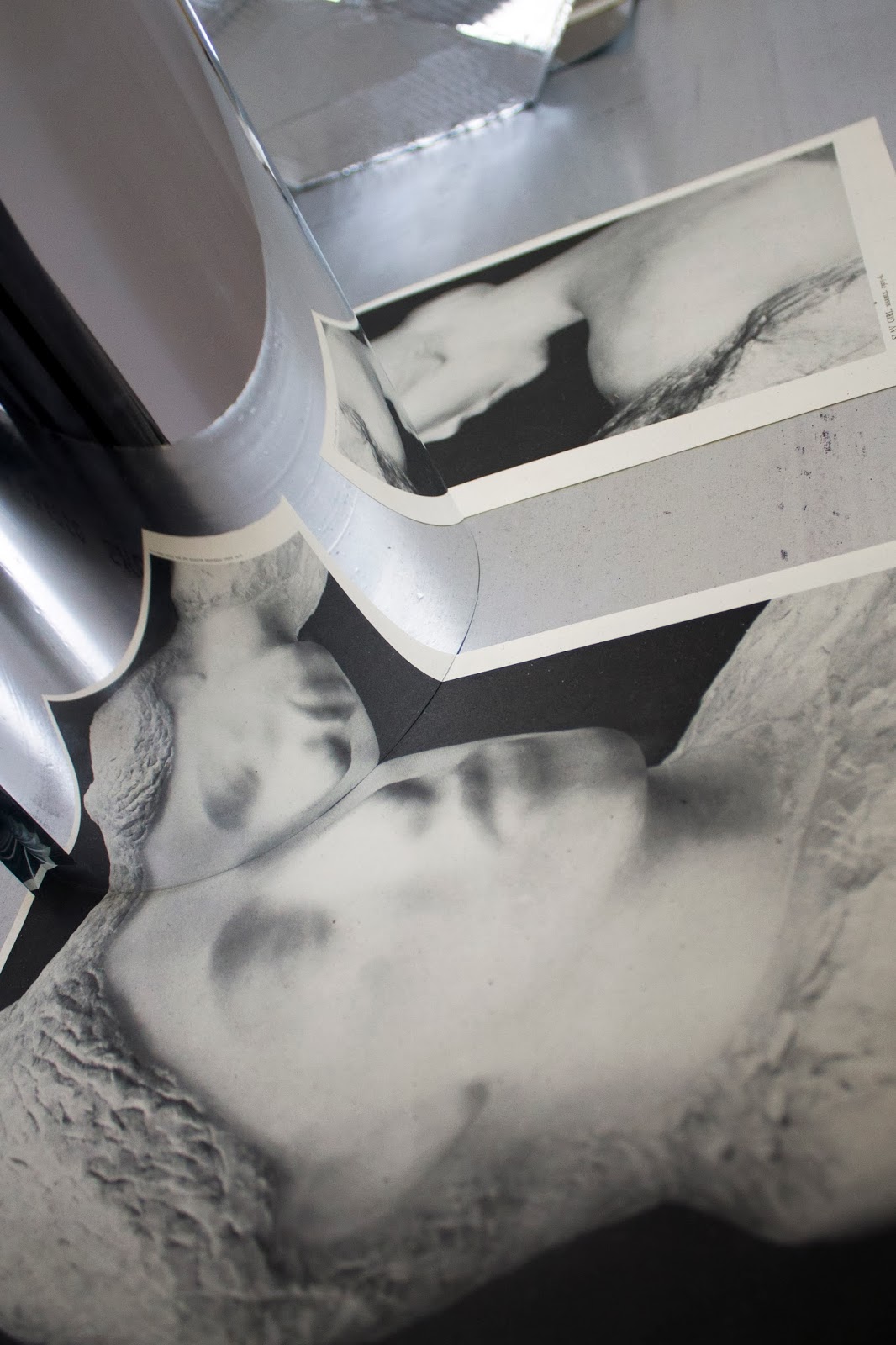
First up was a set of six colour photographs. Each one featured a suburban house, nicely positioned, nice sunny day, neat gardens and trees. Polish houses, 1970's Commie vernacular architecture. But on closer scrutiny, and scrutiny is what these images demand, we can see something a bit odd going on. The very familiarity of the image acts as the best camouflage. It traps us. We are not sure why. An uneasy feeling, that's for sure.
Living in these houses, the series is called Vision Machines by the way, would be problematic. Firstly, internal illumination would be inconsistent, certain windows wouldn't open, phoning out for pizza would be iffy and the internal structure would no doubt resemble an M.C Escher print of staircases. Not to mention that one wall is partially constructed from a tree. And not in a good way. You can see the sky through the branches. It would be draughty to say the least. In theory the building should collapse. It hasn't. Digital collage is a powerful medium.
Dale has in fact been playing games with us, our expectations of what an image should look like, and he's been enjoying his Photoshop. He has transposed the fronts of houses, the edges of houses, garage walls and so on. Keeping to the lines, the verticals and the horizontals of the architectural style, his dwellings are visually ambiguous. There is a lot of visual clutter which aids the authenticity of the pictures. Details often do. The clinchers of course are the verticals and horizontals.
The mind says "house",while the eyes are taking in contradictory information. A doctor may be reminded of people who present with mild schizophrenia. These are pretty darned tooting images in a deadpan kind of way.
I am not suggesting you take out your pen and circle the inconsistencies in these photographs, but if you were to do such a thing, I reckon you would be surprised. There are more than you think, and extra ones keep popping up when you least expect them. It would be a mistake to mention John Stezaker in this context.People tend to mention him because his very name has come to represent a certain type of image making and visual referencing. He may be to collage what the guillotine was to the French aristocracy. And I mean that in a good way.
Dale's images of houses are a lot more subtle. I for one will never look in an estate agent's window the same way again. And I will never buy a house in Poland; judging from the evidence on view, and given the state of my luck, I daresay the thing would fall down in a stiff breeze.
There is something that looks a bit like a battered, giant gold dental filling when seen from afar. It rests on a white boxy wooden plinth. This object desperately needs your help. It is called icave and without you, yes you, it will not live up to its name.
Closer inspection reveals this form to be constructed from masks sourced from joke shops and fancy dress stores. Visually it is held together with expanded foam and I guess there is some kind of armature somewhere. It looks kind of fragile.
The masks draw you in. Then you see that they all face inwards to a certain degree. Inevitably you have to look through the eye holes. It is a basic human compunction. It has to be repeated from other angles, through other masks. It's like being a nosey parker. Or a neighbourhood snitch.
What you see of course, when peering through to the interior, are more images of masks staring right back at you, unblinking. It is you who blink and it is perhaps this simple action that makes you think about the title of the work. It is a classic "I get it" moment.
It is a cartoony type of work. Good cartoony, not Mickey Mouse, he's a bit of a busted flush in the appropriation stakes. I recognised a couple of Star Wars storm trooper masks. This lightness of touch culturally makes the piece function as a witty one liner. Imagine if you had to look through the eyes of Pol Pot, Stalin or Hitler and see other mass murdering psychopaths looking back at you? Of course if you were a deranged ultra rich oligarch you would probably ask Dale to make a copy of icave using masks of only your own face and out of real gold. But that way Deep Kitsch can be seen lurking on the horizon.This work is thankfully, not Deep Kitsch. Oligarchs hoover up Deep Kitsch like it was yesterday's cocaine, or tomorrow's weaknesses.
Dale's icave looks cheap and expensive all at the same time, I guess it's the fact that plastic masks are thin and plasticky and yet gold is a powerful attracter, so there is a degee of tension. However, the illusionistic hollowness of the object is the main point, it does not totally come into its own unless you look into its interior. There is a mirror within. The masks are of course joke masks, and that is what you see peering inside the sculpture. Just don't look too closely in the bathroom mirror the next day. You just might not like what you see anymore.
Confronting a sculpture called Divining Rods is a weird mental echo-ey type of experience. It has a magic type of name. Magic with a "k". Magick. A weird, creepy fruit loop, ley line loving latterday druid sort of bonkers name.
What you see, placed upon a white wooden shelf are a variety of basic geometrical shapes. They are, from left to right: a sphere, a cone, a cube and a pyramid. They are made from concrete and can be easily lifted with two hands. Above each object, resting on a white bracket is the type of wooden cross that puppeteers use to manipulate their mannequins. Four, semi taut lenghts of black twine connect each form to its controlling mechanism. So far, so symbolic. Real puppets need more strings. Don't we all.
A non-sculptor would be nonplussed.
Of course, if you had been paying even the slightest attention to matters sculptural over the past ten years, you would have got it in a flash. "Ah ha! Of course. This is a Platonically inflected satire commenting on the fact that recent sculpture, in some circles at least, is considered contingent upon meaning being dependent on social relations." A bold approach I thought. And not unlike walking past your local Next clothing store.
I didn't get it at first but Dale was kind enough to bravely ride to the rescue of my ignorance in the form of a very helpful email. I had to read it twice.
So what we are faced with essentially is a quiet and subtle but nevertheless ticking time bomb of a certain kind of cultural attitude and meaning. The object withholds its information to all but a few but carries within it evidence of hard fought arguments. And food for thought. We often consider artists to be loners, but they are learners too.This piece reveals Dale to be a thoughtful producer.
Desperate to give Divining Rods my own slant I resorted to a more basic scenario. This piece needs to settle down somewhere nice. Perhaps in Jim Ede's gaff up on the hill. With a nice tidy Hepworth. Side by side, they could bicker for ages, just like a married couple. The bliss of wedded context. Mind you, I wouldn't let my kids anywhere near theirs. Terrible family. The man is a bit sarcastic and the woman thinks she is better than everyone else.
The projection room was making a terrible racket, so in I went to have a dekko at a piece called Rubble Carousel. I have to say that had I been between 80 and 90 years of age, and had lived through the Blitz of 1940, I may well have felt tearful. Or plain scared. The soundtrack was tragic in its intensity. There are several things going on in this piece. It is montaged and seems heavily edited. It could also only be made in the age of the Internet. Years ago it would have been harder and far less convenient to source Dale's images of collapsing buildings. Atomic Cafe comes to mind, a film directed by Loader, Rafferty and Rafferty back in 1982.
Dale's film lasts for just over three minutes or so. We see massive U.S buildings being demolished by explosives in order to further monitise the next tranche of newly available real estate. Superimposed upon this is a nocturnal circuit around the East End of London. And yes, we see the East End but, but maybe it is not as apparent to a foreign audience. Most cities do have an East End of some kind, some place where bombs rained down. My Granddad was a fireman in the Blitz. He said people had been turned into lard. Charred bones and lard. I think Dale's references are probably less specific than my associations.
The piece is called Rubble Carousel, and somewhere out there is a painting called Merry Go Round by Mark Gertler. I hope they inhabit the same room one day. The film ends with a heads down shot of some front garden vegetation. The shot shakes a bit. Bomb conccussions. From history.
I have had uncomfortable dealings with several Ministries of Interiors, so I was naturally drawn to the title of this work, called worryingly, Ministry of the Interior. Also it looked like a piece of work that would attract attention. And indeed it has.
A life-sized bouncy castle, stalwart plaything of soft play areas and village green fun days, fills up the space. Its pneumatic spires and turrets just touch the ceiling. They tremble slightly. The air compressor adds its own drone. By default it becomes part of the work, its artificial sign of life. No child yells in joy. No parent calls out an admonition to take care.
There is one more thing about this particular bouncy castle; it is made from black leatherette. It has a particularly malevolent sheen. In the Aid and Abet space it has been cloistered away from the other exhibits. It exists in its own discomfort zone. It is though, a bouncy castle in almost every other respect. I walked all around it to make sure. It is an ominous object.
Dale was careful to mention that bouncing as such, was a no go area. I wondered aloud whether my kids could bounce upon this leatherlike citadel if they were similarly clad in black leatherette. "You dress your kids in leather?" Dale moved away to talk to a weighty woman in chunky wooden jewellery and her daughter, who was straight out of a Currin painting.
Quite rightly this piece has garnered a lot of interest. It is the most iconic piece in this show, although not necessarily the most powerful or interesting in my view. You could put it in one of those prefabricated concrete art bunkers that have spawned all over Europe since the 60's.
It could hunker down next to a Sylvie Fleury pink plastic V2 type missile.They could bask in their own mutual sense of contradictory visual purpose. Viewers could try out their wry smiles.
And yet, given the theatricality of this piece, a bland exhibition space is not sufficient. It needs its own barn somewhere on a deserted and wind swept moor. A place where the grass grows long and the weeds poke up through the wheel spokes of the two rusting kids' bikes casually dumped years ago.
More kids arrive. Best friends. Two 10 year olds. Are they trespassing by going into the barn? One thing is for sure, their bottles of Lucozade won't help them much as they clamber aboard.
For they have discovered, "THE BOUNCY CASTLE OF DOOM."
The most significant piece in the show is a piece called High Noon. It is also the most intelligent piece in the show, although not for reasons that everyone will agree on. So, I am going to tread extremely carefully.
What we see is a fairly large, rectangular, red carpet, sourced from a place in the Holloway Road. It is the type of carpet you find in government offices and N.A.T.O military headquarters. Perhaps it came from Allied Carpets. Too big for a domestic setting it lays there before us. No furniture is present.
In the centre, clearly impressed upon the pile, is a disc shape. Quite crisply done. Equispaced, at 12, 3, 6 and 9 o'clock positions are other discs , slightly different in design. The designs have a sharpness. Clearly something heavy has caused these formal elements.
People have been muttering " missile launcher" for a while now. In fact a four ton missile launcher. This piece of military equipment was rested upon the carpet for a whole day. I'd like to see the photographs, quite an unexpected pairing I should imagine.
Dale's interest is with absence. The trace remains. Unfortunately we may be constrained to use this word. I don't think it is strictly necessary. Trace is too delicate a word. C.S.I Miami this is not. It is not a strand of hair. The piece is about decisions made in smokey rooms fraught with dread, sweat and fear. In theory you might think of Dr. Strangelove and the scene in the War Room, if you were feeling frisky and innocently carefree that is.You would be wrong to do so. Your imaginative eavesdropping should target Bush and Blair. The Chuckle Brothers of mass destruction.
In reality the piece references decisions that result in faraway death, chaos and breakdown of infrastructure. Perhaps Basra Road death from the air destruction. Or perhaps Predator drone strikes on targets whittled down to a high probability of an accurate kill through the power of computing, otherwise known as death through data. And Hellfire missiles. There is of course a massive sense of absence in this context, as drone pilots are often based in Nevada.
Dale used a film props company to get hold of a launcher to suit his conceptual and formal design concerns.
This piece of equipment was used to support a Thunderbird anti-aircraft missile. These missiles were big in the 1960's, defending airfields against Russian interlopers. Or nuclear bombers as we used to call them.
So, still treading extremely carefully, and approaching this work with my own bunch of insecurities, I sort of question the use of a blatantly Cold War piece of hardware. I remember hiding under the kitchen table as a kid during the Cuban Missile Crisis. Dale's High Noon disturbs me in a way that other, younger people will not have experienced, and therefore feels displaced but also of my time. Formally, as an artwork it is spot on. Perhaps it is enough to know the design was impressed into the red pile and know it was just red. Not Red as in Red Menace, Reds under the Bed or Red Army.
My dumb feeling is that, well, a cruise missile reference may have been more effective, if we are going to put our pedant's hat on when it comes to weapons systems and the age we are living through. Imprints of anti-aircraft missile launchers from the Cold War era do not necessarily represent the absent traces made by folks bent on faraway holocaust. But I am just a guy who saw the first Gulf War start. On the T.V. In a 5 star hotel. In the penthouse suite. In an Arabic state. Just how picky can I be? Ridiculous! On the other hand you have to realise I am a guy who likes to be locked away with paper and notebooks. I am not a guy who rings up a film prop company enquiring about missile systems. Can you imagine the conversation? "Hello? Is that the company that does all the missiles and stuff for the films? It is? Good, well I was in the Holloway Road the other day and..." Dale does this sort of thing all the time. I on the other hand, sharpen pencils.
Colin Self is a big hero of mine. He sure knows how to sharpen pencils. In an ideal world Dales's High Noon would be in one of the Imperial War Museums somewhere. Quite nearby, on a wall rather than a floor, would be Guard Dog on a Missile Base No.1 by Colin Self. A man's life time separates these two works and yet they articulate a similar sense of unease. Dale's piece is the more understated. These days I don't expect to vapourised by an H-Bomb.
As far as I know Dale prevents people from walking on High Noon. Who does the hoovering then?
No wonder I have been treading so carefully.
Certainly there is a lot to think about in this show. Mooching about is important in order to take it all in, there's a lot to consider.
Aid and Abet have provided an outstanding space and support services for a polished solo show. The space possesses a kind of ex-G.P.O warehouse boho chic which sets off artworks to an advantage.There is a lot of space to play with and two of Dale's pieces are quite large.
I think the thing with Dale is that he is a problem solver. He is a designer as well as an artist. All the works in this show are separated by look, intention, technique and material. There are other artists who work at widening and refining an existing vocabulary. Dale's one offs constitute an evolving resource of meaning.
Nevertheless the work looks like it could have been produced by a design collective, possibly because a bit of outsourcing has been going on. Yet enough of a quirky vibe exists to indicate that Donald Judd, like Elvis, has left the building.
So, what are we left with as we trudge away from the venue? What meanings and flavours have been squeezed out ? What is going to keep us company during the Winter nights?
Well, gold is seductive but ultimately the attraction becomes meaningless and empty. Just like us.
The Blitz was really noisy. Architecture proved to be a throw away medium.
The debates around sculpture were more vicious than I could ever have imagined.
Terry Pratchett, the author of the fantasy Discworld novels, should buy Ministry of the Interior. Or the work should be given its own T.V show. It could be called "The Bouncy Castle's Haunted Half Hour."
Polish plumbers are great. Builders of houses less so.
High Noon, a piece that had a meaning literally impressed upon itself and reciprocally impressed upon us.
This was the final show of Aid and Abet's 2013 programme. They will be moving soon. Their building is going to be torn down to make way for swanky emporia or a car park for city drones. Something useless anyway.
Slaves of Google can find Tom Dale in Conversation with Gabriel Coxhead, an art critic and writer.
In theory, Tom Dale is represented by Poppy Sebire. But I do not honestly know any more and it seems churlish to ask. There is a link below. Finally I would like to say thanks to Tom Dale who actually was quite happy to chat and send emails.
www.daletom.com
www.aidandabet.co.uk
I sat in a pub called The Flying Pig in order to ponder the problem of the name. Catchy, I thought, but maybe also a tad incorrect. Zero is infinite. Anyway, that is neither here nor there. Leaving the pub I attempted to cross the road. This was such a risky undertaking (and undertaking was on my mind at the time, believe me) that I thought that the pub should be renamed The Flying Corpse.
Anyway, I got to Aid and Abet pretty quickly, and having left the dog and my white cane outside, I ventured within. Luckily there was something to drink. And it was £2 a pop. Alcoholic drinks were also £2 a pop. This word "pop" is probably quite a useful one to keep in mind, just vaguely, not in capital letters or anything.
First up was a set of six colour photographs. Each one featured a suburban house, nicely positioned, nice sunny day, neat gardens and trees. Polish houses, 1970's Commie vernacular architecture. But on closer scrutiny, and scrutiny is what these images demand, we can see something a bit odd going on. The very familiarity of the image acts as the best camouflage. It traps us. We are not sure why. An uneasy feeling, that's for sure.
Living in these houses, the series is called Vision Machines by the way, would be problematic. Firstly, internal illumination would be inconsistent, certain windows wouldn't open, phoning out for pizza would be iffy and the internal structure would no doubt resemble an M.C Escher print of staircases. Not to mention that one wall is partially constructed from a tree. And not in a good way. You can see the sky through the branches. It would be draughty to say the least. In theory the building should collapse. It hasn't. Digital collage is a powerful medium.
Dale has in fact been playing games with us, our expectations of what an image should look like, and he's been enjoying his Photoshop. He has transposed the fronts of houses, the edges of houses, garage walls and so on. Keeping to the lines, the verticals and the horizontals of the architectural style, his dwellings are visually ambiguous. There is a lot of visual clutter which aids the authenticity of the pictures. Details often do. The clinchers of course are the verticals and horizontals.
The mind says "house",while the eyes are taking in contradictory information. A doctor may be reminded of people who present with mild schizophrenia. These are pretty darned tooting images in a deadpan kind of way.
I am not suggesting you take out your pen and circle the inconsistencies in these photographs, but if you were to do such a thing, I reckon you would be surprised. There are more than you think, and extra ones keep popping up when you least expect them. It would be a mistake to mention John Stezaker in this context.People tend to mention him because his very name has come to represent a certain type of image making and visual referencing. He may be to collage what the guillotine was to the French aristocracy. And I mean that in a good way.
Dale's images of houses are a lot more subtle. I for one will never look in an estate agent's window the same way again. And I will never buy a house in Poland; judging from the evidence on view, and given the state of my luck, I daresay the thing would fall down in a stiff breeze.
 |
Tom Dale, middle. |
There is something that looks a bit like a battered, giant gold dental filling when seen from afar. It rests on a white boxy wooden plinth. This object desperately needs your help. It is called icave and without you, yes you, it will not live up to its name.
Closer inspection reveals this form to be constructed from masks sourced from joke shops and fancy dress stores. Visually it is held together with expanded foam and I guess there is some kind of armature somewhere. It looks kind of fragile.
The masks draw you in. Then you see that they all face inwards to a certain degree. Inevitably you have to look through the eye holes. It is a basic human compunction. It has to be repeated from other angles, through other masks. It's like being a nosey parker. Or a neighbourhood snitch.
What you see of course, when peering through to the interior, are more images of masks staring right back at you, unblinking. It is you who blink and it is perhaps this simple action that makes you think about the title of the work. It is a classic "I get it" moment.
It is a cartoony type of work. Good cartoony, not Mickey Mouse, he's a bit of a busted flush in the appropriation stakes. I recognised a couple of Star Wars storm trooper masks. This lightness of touch culturally makes the piece function as a witty one liner. Imagine if you had to look through the eyes of Pol Pot, Stalin or Hitler and see other mass murdering psychopaths looking back at you? Of course if you were a deranged ultra rich oligarch you would probably ask Dale to make a copy of icave using masks of only your own face and out of real gold. But that way Deep Kitsch can be seen lurking on the horizon.This work is thankfully, not Deep Kitsch. Oligarchs hoover up Deep Kitsch like it was yesterday's cocaine, or tomorrow's weaknesses.
Dale's icave looks cheap and expensive all at the same time, I guess it's the fact that plastic masks are thin and plasticky and yet gold is a powerful attracter, so there is a degee of tension. However, the illusionistic hollowness of the object is the main point, it does not totally come into its own unless you look into its interior. There is a mirror within. The masks are of course joke masks, and that is what you see peering inside the sculpture. Just don't look too closely in the bathroom mirror the next day. You just might not like what you see anymore.
Confronting a sculpture called Divining Rods is a weird mental echo-ey type of experience. It has a magic type of name. Magic with a "k". Magick. A weird, creepy fruit loop, ley line loving latterday druid sort of bonkers name.
What you see, placed upon a white wooden shelf are a variety of basic geometrical shapes. They are, from left to right: a sphere, a cone, a cube and a pyramid. They are made from concrete and can be easily lifted with two hands. Above each object, resting on a white bracket is the type of wooden cross that puppeteers use to manipulate their mannequins. Four, semi taut lenghts of black twine connect each form to its controlling mechanism. So far, so symbolic. Real puppets need more strings. Don't we all.
A non-sculptor would be nonplussed.
Of course, if you had been paying even the slightest attention to matters sculptural over the past ten years, you would have got it in a flash. "Ah ha! Of course. This is a Platonically inflected satire commenting on the fact that recent sculpture, in some circles at least, is considered contingent upon meaning being dependent on social relations." A bold approach I thought. And not unlike walking past your local Next clothing store.
I didn't get it at first but Dale was kind enough to bravely ride to the rescue of my ignorance in the form of a very helpful email. I had to read it twice.
So what we are faced with essentially is a quiet and subtle but nevertheless ticking time bomb of a certain kind of cultural attitude and meaning. The object withholds its information to all but a few but carries within it evidence of hard fought arguments. And food for thought. We often consider artists to be loners, but they are learners too.This piece reveals Dale to be a thoughtful producer.
Desperate to give Divining Rods my own slant I resorted to a more basic scenario. This piece needs to settle down somewhere nice. Perhaps in Jim Ede's gaff up on the hill. With a nice tidy Hepworth. Side by side, they could bicker for ages, just like a married couple. The bliss of wedded context. Mind you, I wouldn't let my kids anywhere near theirs. Terrible family. The man is a bit sarcastic and the woman thinks she is better than everyone else.
The projection room was making a terrible racket, so in I went to have a dekko at a piece called Rubble Carousel. I have to say that had I been between 80 and 90 years of age, and had lived through the Blitz of 1940, I may well have felt tearful. Or plain scared. The soundtrack was tragic in its intensity. There are several things going on in this piece. It is montaged and seems heavily edited. It could also only be made in the age of the Internet. Years ago it would have been harder and far less convenient to source Dale's images of collapsing buildings. Atomic Cafe comes to mind, a film directed by Loader, Rafferty and Rafferty back in 1982.
Dale's film lasts for just over three minutes or so. We see massive U.S buildings being demolished by explosives in order to further monitise the next tranche of newly available real estate. Superimposed upon this is a nocturnal circuit around the East End of London. And yes, we see the East End but, but maybe it is not as apparent to a foreign audience. Most cities do have an East End of some kind, some place where bombs rained down. My Granddad was a fireman in the Blitz. He said people had been turned into lard. Charred bones and lard. I think Dale's references are probably less specific than my associations.
My feeling is that Dale has mentioned the real estate thing too often. It is an aside which detracts from the visual impact. It is a point of interest in the construction of something which is much larger and more important in terms of a certain strand of social history. This is absolutely not a criticism. He is, as the maker of the piece, naturally concerned with its sources and techniques of construction. I was interested too in how it was made and Dale was kind enough to provide a few technical details. The film provides us with the type of rolling imagery that seems to reference those montages of mental turmoil that we see in made for t.v movies. An American detective, usually an ex-marine, is tossing and turning in bed, beaded with sweat. He wakes with a start. "What is it honey?" says his wife. "Same old dream, hon," comes the reply.
The piece is called Rubble Carousel, and somewhere out there is a painting called Merry Go Round by Mark Gertler. I hope they inhabit the same room one day. The film ends with a heads down shot of some front garden vegetation. The shot shakes a bit. Bomb conccussions. From history.
I have had uncomfortable dealings with several Ministries of Interiors, so I was naturally drawn to the title of this work, called worryingly, Ministry of the Interior. Also it looked like a piece of work that would attract attention. And indeed it has.
A life-sized bouncy castle, stalwart plaything of soft play areas and village green fun days, fills up the space. Its pneumatic spires and turrets just touch the ceiling. They tremble slightly. The air compressor adds its own drone. By default it becomes part of the work, its artificial sign of life. No child yells in joy. No parent calls out an admonition to take care.
There is one more thing about this particular bouncy castle; it is made from black leatherette. It has a particularly malevolent sheen. In the Aid and Abet space it has been cloistered away from the other exhibits. It exists in its own discomfort zone. It is though, a bouncy castle in almost every other respect. I walked all around it to make sure. It is an ominous object.
Dale was careful to mention that bouncing as such, was a no go area. I wondered aloud whether my kids could bounce upon this leatherlike citadel if they were similarly clad in black leatherette. "You dress your kids in leather?" Dale moved away to talk to a weighty woman in chunky wooden jewellery and her daughter, who was straight out of a Currin painting.
Quite rightly this piece has garnered a lot of interest. It is the most iconic piece in this show, although not necessarily the most powerful or interesting in my view. You could put it in one of those prefabricated concrete art bunkers that have spawned all over Europe since the 60's.
It could hunker down next to a Sylvie Fleury pink plastic V2 type missile.They could bask in their own mutual sense of contradictory visual purpose. Viewers could try out their wry smiles.
And yet, given the theatricality of this piece, a bland exhibition space is not sufficient. It needs its own barn somewhere on a deserted and wind swept moor. A place where the grass grows long and the weeds poke up through the wheel spokes of the two rusting kids' bikes casually dumped years ago.
More kids arrive. Best friends. Two 10 year olds. Are they trespassing by going into the barn? One thing is for sure, their bottles of Lucozade won't help them much as they clamber aboard.
For they have discovered, "THE BOUNCY CASTLE OF DOOM."
The most significant piece in the show is a piece called High Noon. It is also the most intelligent piece in the show, although not for reasons that everyone will agree on. So, I am going to tread extremely carefully.
What we see is a fairly large, rectangular, red carpet, sourced from a place in the Holloway Road. It is the type of carpet you find in government offices and N.A.T.O military headquarters. Perhaps it came from Allied Carpets. Too big for a domestic setting it lays there before us. No furniture is present.
In the centre, clearly impressed upon the pile, is a disc shape. Quite crisply done. Equispaced, at 12, 3, 6 and 9 o'clock positions are other discs , slightly different in design. The designs have a sharpness. Clearly something heavy has caused these formal elements.
People have been muttering " missile launcher" for a while now. In fact a four ton missile launcher. This piece of military equipment was rested upon the carpet for a whole day. I'd like to see the photographs, quite an unexpected pairing I should imagine.
Dale's interest is with absence. The trace remains. Unfortunately we may be constrained to use this word. I don't think it is strictly necessary. Trace is too delicate a word. C.S.I Miami this is not. It is not a strand of hair. The piece is about decisions made in smokey rooms fraught with dread, sweat and fear. In theory you might think of Dr. Strangelove and the scene in the War Room, if you were feeling frisky and innocently carefree that is.You would be wrong to do so. Your imaginative eavesdropping should target Bush and Blair. The Chuckle Brothers of mass destruction.
In reality the piece references decisions that result in faraway death, chaos and breakdown of infrastructure. Perhaps Basra Road death from the air destruction. Or perhaps Predator drone strikes on targets whittled down to a high probability of an accurate kill through the power of computing, otherwise known as death through data. And Hellfire missiles. There is of course a massive sense of absence in this context, as drone pilots are often based in Nevada.
Dale used a film props company to get hold of a launcher to suit his conceptual and formal design concerns.
This piece of equipment was used to support a Thunderbird anti-aircraft missile. These missiles were big in the 1960's, defending airfields against Russian interlopers. Or nuclear bombers as we used to call them.
So, still treading extremely carefully, and approaching this work with my own bunch of insecurities, I sort of question the use of a blatantly Cold War piece of hardware. I remember hiding under the kitchen table as a kid during the Cuban Missile Crisis. Dale's High Noon disturbs me in a way that other, younger people will not have experienced, and therefore feels displaced but also of my time. Formally, as an artwork it is spot on. Perhaps it is enough to know the design was impressed into the red pile and know it was just red. Not Red as in Red Menace, Reds under the Bed or Red Army.
My dumb feeling is that, well, a cruise missile reference may have been more effective, if we are going to put our pedant's hat on when it comes to weapons systems and the age we are living through. Imprints of anti-aircraft missile launchers from the Cold War era do not necessarily represent the absent traces made by folks bent on faraway holocaust. But I am just a guy who saw the first Gulf War start. On the T.V. In a 5 star hotel. In the penthouse suite. In an Arabic state. Just how picky can I be? Ridiculous! On the other hand you have to realise I am a guy who likes to be locked away with paper and notebooks. I am not a guy who rings up a film prop company enquiring about missile systems. Can you imagine the conversation? "Hello? Is that the company that does all the missiles and stuff for the films? It is? Good, well I was in the Holloway Road the other day and..." Dale does this sort of thing all the time. I on the other hand, sharpen pencils.
Colin Self is a big hero of mine. He sure knows how to sharpen pencils. In an ideal world Dales's High Noon would be in one of the Imperial War Museums somewhere. Quite nearby, on a wall rather than a floor, would be Guard Dog on a Missile Base No.1 by Colin Self. A man's life time separates these two works and yet they articulate a similar sense of unease. Dale's piece is the more understated. These days I don't expect to vapourised by an H-Bomb.
As far as I know Dale prevents people from walking on High Noon. Who does the hoovering then?
No wonder I have been treading so carefully.
Certainly there is a lot to think about in this show. Mooching about is important in order to take it all in, there's a lot to consider.
Aid and Abet have provided an outstanding space and support services for a polished solo show. The space possesses a kind of ex-G.P.O warehouse boho chic which sets off artworks to an advantage.There is a lot of space to play with and two of Dale's pieces are quite large.
I think the thing with Dale is that he is a problem solver. He is a designer as well as an artist. All the works in this show are separated by look, intention, technique and material. There are other artists who work at widening and refining an existing vocabulary. Dale's one offs constitute an evolving resource of meaning.
Nevertheless the work looks like it could have been produced by a design collective, possibly because a bit of outsourcing has been going on. Yet enough of a quirky vibe exists to indicate that Donald Judd, like Elvis, has left the building.
So, what are we left with as we trudge away from the venue? What meanings and flavours have been squeezed out ? What is going to keep us company during the Winter nights?
Well, gold is seductive but ultimately the attraction becomes meaningless and empty. Just like us.
The Blitz was really noisy. Architecture proved to be a throw away medium.
The debates around sculpture were more vicious than I could ever have imagined.
Terry Pratchett, the author of the fantasy Discworld novels, should buy Ministry of the Interior. Or the work should be given its own T.V show. It could be called "The Bouncy Castle's Haunted Half Hour."
Polish plumbers are great. Builders of houses less so.
High Noon, a piece that had a meaning literally impressed upon itself and reciprocally impressed upon us.
This was the final show of Aid and Abet's 2013 programme. They will be moving soon. Their building is going to be torn down to make way for swanky emporia or a car park for city drones. Something useless anyway.
Slaves of Google can find Tom Dale in Conversation with Gabriel Coxhead, an art critic and writer.
In theory, Tom Dale is represented by Poppy Sebire. But I do not honestly know any more and it seems churlish to ask. There is a link below. Finally I would like to say thanks to Tom Dale who actually was quite happy to chat and send emails.
www.daletom.com
www.aidandabet.co.uk
 |
Aid and Abet 2013 |
Thursday, 14 November 2013

Monday, 11 November 2013

Saturday, 9 November 2013

Wednesday, 23 October 2013


Saturday, 19 October 2013
Aid and Abet and the mystery of... An Unnatural Theatre.
Under normal circumstances you would never drag me into a show called An Unnatural Theatre. I am of the old school. I like titles such as "Bob Jones. Recent Work." or "Avril Condescension-Jones, RA. Ten years of Drawing." My main anxiety of course, as it must be for you, is being ambushed by performance artists in their wholemeal vegetarian jumpers and pointy hair. So, it was with this image in mind that I crossed the psychic barrier and popped into Aid and Abet.
First up was CJ Mahony's immersive sculpture. It is called The Trouble with Time. You have to enter her sculpture. Through a doorway. Into a twisty, constricted, tight fitting, unpredictable corridor. From beginning to end it is too narrow for the large of girth. It is a sideways experience and Heaven help you if you meet someone you have not been previously introduced to coming the other way. She says, in her artist's notes for the show, that she is undermining our expectation of a comfortable distance between our bodies and the walls of the gallery. She is right. I was being cuddled by gallery walls. I certainly couldn't consider taking a step back. I spend my entire life in galleries taking steps back. But here I couldn't. I couldn't take a step forwards either.
Mahony, with this piece at least, seems full of the joys of Spring and obviously a dab hand with power saws, drills, nuts and bolts, brackets, exact measurements, precise angles, design drawings and sheets of wood taller than a basketball player at full stretch. Not to mention Health and Safety regulations persuant to the Construction of Sculptural Objects in a Space to which the Public have Access.
Once I was lodged inside, the walls loomed and unexpected angles of passage presented themselves. It was like a whitewashed Expressionist film set. Dr. Caligari meets 1970's Dr. Who. It's a tight, angular squeeze and you are not sure where you are going. It will not suit the claustrophobe that's for sure. It is however a purely horizontal journey. I felt a bit of slope and incline would have augmented the experience. But that's not a criticism, I'm just one of those irritating people who yell out, "Hey, you missed a spot!" It is also not the point for it dawned on me that I was the sculpture's sole moving part. I was in its thrall. After a minute or two I was peristaltically eased out and found myself in the car park. Quickly dismissing the thought that the car park and the surrounding area could be considered part of the artwork, which had after all just consumed me and ejected me into this place, I had a realisation. For one brief moment I had an idea of what it must have been like to be Bruce McLean back in the day. Even my hair felt a little pointier.
But, this piece is by CJ Mahony . And it is her day now.

Alice Walton's work in the show is an altogether different experience. It is less kinaesthetic for a start. Any moving around is peripheral.
A table, constructed from a lightweight building material dominates a space. The space has been separated out from the show. Cosseted away.
Resting on the table are a variety of geometrical or architectural units. They are aligned with horizontally placed colour photocopies of art images. It has the feel of a Blake's Seven studio set, seemingly inexpensive and silvery.
The work is rewardingly tricky to look at. Not because of what it is, but because of what it could be.
You have to be really careful looking at this. You have to be Clint Eastwood in a Fistful of Dollars. Narrow of eye. Cheroot.
Then there are all the intrusive thoughts to banish. Mike Kelly, early Star Trek, Space 1999, Miss Haversam's wedding breakfast. But what is being associated is not what is being looked at.
Most of the units on the table could well have been sourced from Rymans. Silver card sellotaped together. They could have photocopied the art illustrations too.
My guess is that there is a kind of argument going on about the primacy of object over image or image being superior to the adjacent forms. This argument is irrelevant. The real interest in the piece is the trapping, warping and morphing of reflected imagery. And what happens in this interface is essentially magic. Or at least too technically complex to waste time on. And yet it is the cheap and ephemeral which achieves this.
When your shoe hits the puddle and the neon reflection shatters and reforms.It is this experience that has been suspended in time through the simplest of materials.
What is fascinating about the piece is that it was quite challenging for my mental viewfinder to grasp.The trapping of an image within a surface. Mirror like, you are caught and beguiled. And like my own over familiar reflection in a plate glass window there is a sense of delusional wonder. "My God. Is that you? Not bad for an out of shape, badly dressed middle aged guy going to the pub. Watch out babes!"
So what I took away with me from this piece was not an overall impression of form or the role of the imagery. The images in fact could have been harder but then it would have been a different piece. The piece doesn't repay the viewer by thinking, "Yeah, a table with objects on it." It repays by scrutiny from as many different angles as possible. The focus is on the reflected imagery rather than the materials causing it.
Walton's achievement is that of creating a setting for which the the insubstantial exists equally with the constructed. I expect for Christmas she'd like a chandelier and a close-up lens. And a photocopy machine. The piece, I believe is called Table.

First up was CJ Mahony's immersive sculpture. It is called The Trouble with Time. You have to enter her sculpture. Through a doorway. Into a twisty, constricted, tight fitting, unpredictable corridor. From beginning to end it is too narrow for the large of girth. It is a sideways experience and Heaven help you if you meet someone you have not been previously introduced to coming the other way. She says, in her artist's notes for the show, that she is undermining our expectation of a comfortable distance between our bodies and the walls of the gallery. She is right. I was being cuddled by gallery walls. I certainly couldn't consider taking a step back. I spend my entire life in galleries taking steps back. But here I couldn't. I couldn't take a step forwards either.
Mahony, with this piece at least, seems full of the joys of Spring and obviously a dab hand with power saws, drills, nuts and bolts, brackets, exact measurements, precise angles, design drawings and sheets of wood taller than a basketball player at full stretch. Not to mention Health and Safety regulations persuant to the Construction of Sculptural Objects in a Space to which the Public have Access.
Once I was lodged inside, the walls loomed and unexpected angles of passage presented themselves. It was like a whitewashed Expressionist film set. Dr. Caligari meets 1970's Dr. Who. It's a tight, angular squeeze and you are not sure where you are going. It will not suit the claustrophobe that's for sure. It is however a purely horizontal journey. I felt a bit of slope and incline would have augmented the experience. But that's not a criticism, I'm just one of those irritating people who yell out, "Hey, you missed a spot!" It is also not the point for it dawned on me that I was the sculpture's sole moving part. I was in its thrall. After a minute or two I was peristaltically eased out and found myself in the car park. Quickly dismissing the thought that the car park and the surrounding area could be considered part of the artwork, which had after all just consumed me and ejected me into this place, I had a realisation. For one brief moment I had an idea of what it must have been like to be Bruce McLean back in the day. Even my hair felt a little pointier.
But, this piece is by CJ Mahony . And it is her day now.

The Trouble with Time, (details) |
Alice Walton's work in the show is an altogether different experience. It is less kinaesthetic for a start. Any moving around is peripheral.
A table, constructed from a lightweight building material dominates a space. The space has been separated out from the show. Cosseted away.
Resting on the table are a variety of geometrical or architectural units. They are aligned with horizontally placed colour photocopies of art images. It has the feel of a Blake's Seven studio set, seemingly inexpensive and silvery.
The work is rewardingly tricky to look at. Not because of what it is, but because of what it could be.
You have to be really careful looking at this. You have to be Clint Eastwood in a Fistful of Dollars. Narrow of eye. Cheroot.
Then there are all the intrusive thoughts to banish. Mike Kelly, early Star Trek, Space 1999, Miss Haversam's wedding breakfast. But what is being associated is not what is being looked at.
Most of the units on the table could well have been sourced from Rymans. Silver card sellotaped together. They could have photocopied the art illustrations too.
My guess is that there is a kind of argument going on about the primacy of object over image or image being superior to the adjacent forms. This argument is irrelevant. The real interest in the piece is the trapping, warping and morphing of reflected imagery. And what happens in this interface is essentially magic. Or at least too technically complex to waste time on. And yet it is the cheap and ephemeral which achieves this.
When your shoe hits the puddle and the neon reflection shatters and reforms.It is this experience that has been suspended in time through the simplest of materials.
What is fascinating about the piece is that it was quite challenging for my mental viewfinder to grasp.The trapping of an image within a surface. Mirror like, you are caught and beguiled. And like my own over familiar reflection in a plate glass window there is a sense of delusional wonder. "My God. Is that you? Not bad for an out of shape, badly dressed middle aged guy going to the pub. Watch out babes!"
So what I took away with me from this piece was not an overall impression of form or the role of the imagery. The images in fact could have been harder but then it would have been a different piece. The piece doesn't repay the viewer by thinking, "Yeah, a table with objects on it." It repays by scrutiny from as many different angles as possible. The focus is on the reflected imagery rather than the materials causing it.
Walton's achievement is that of creating a setting for which the the insubstantial exists equally with the constructed. I expect for Christmas she'd like a chandelier and a close-up lens. And a photocopy machine. The piece, I believe is called Table.
 |
Untitled (Table) details. |
" Do they cover it with a big plastic bag at night?" I thought to myself. On a large white wooden plinth rests what is known as an informally assembled plastic matrix. Or Big Lump of Clay. This object remains enigmatic. However, it is not too far away from the projection room and there we can find the answer to the riddle of the B.L.C.
Jorge Rivera's film, In the Skin of the Bull is a rich, visually sensual feast with an entwined multistrand narrative firmly anchored within a set of precise cultural references.
The viewing chamber is worryingly dark. I sit on a bench. There is sand underfoot, about half an inch I reckon. Must take a bit of sweeping up. The film lasts for over thirty minutes. Not a big ask really. Nevertheless I have come prepared with sandwiches and a beer. With my feet firmly planted in an immediate reference to the blood stained surfaces found in bullrings, I settle down to watch.
My main problem with the film was not that it was a beautifully structured and authored work of art. It was. The problem was not of Rivera's making. The problem was of David Lynch's making. Particularly Eraserhead and The Elephant Man. Pace, editing, close-ups, some floaty images, some clunky dissolves. Oppressive industrial sound track. Heavy breathing. But this is unfair. These are essential elements, although I can give or take the clunky dissolves.
Rivera however, is the first person as far as I know,to make the lost wax casting method sexy.
First, a slapping sound and next a B.L.C hoves into view, I have seen it before somewhere I am sure. The process begins. The clay is caressed, stroked, teased, poked, reamed out and urged into being. Seductive looking liquids are dripped and poured over smooth, damp, rotund forms. Every nook and cranny is anointed. The camera pulls out slightly and we see the form is recognisably bull like. This is not just any old sequence in the sculptural process, this is a Mark's and Spencer's sequence in the sculptural process. I gazed and thought about my dear wife wreathed in aromatic oils. I thought of soft music and low lights. And then I remembered it was Friday. Friday is her full-contact Karate night.
Snapping back into reality and with tauromachia in the back of my mind, what seems to be a nuclear power station's emergency melt down team are pouring incandescent molten bronze into a sprue-antlered mould.
There are hints of a bull's final fate. Shots from the bull pens. Gates to the ring.
A man's back, lingered over like a landscape, twitches and flexes. A blade travels along the vertebrae indicating the best place to strike a bull dead. Or indeed a man. Toned muscles obligingly jerk in anticipation of the threat made good. Rivera mentions in his exhibition statement that it is skin as a perceptive organ which connects external stimuli to the inner world. Our world, of feelings and memories. The notion is as crucial to the production design as it is central to Rivera's intention.
The most successful sequences and edits remain within the realm of the studio, foundry and finally the bullring. We are given the eyes of the bull. We charge out into the arena. The film fades to white.
The film scores well on its attempt to enrich meaning through a thoughtful and precise articulation of process and narratives. Rivera is an artist's artist. This film is highly instructional as a result. Art students should lap this kind of stuff up. It has everything a student needs to take serious notice of. If I were 17, this would be a mindfuck. If I were 21 and newly graduated I would apply for a job on his team.
In fact... where's the phone? To hell with the 21 year olds.
 |
Remains/Clay and background There,After. |
Aid and Abet is a bit tatty. Paint peels from the walls. Girders are exposed. Obviously they have misplaced the absolute gallons of white emulsion they otherwise get through. Somewhere though, out there, is a little brother to this scruffpot. You can see it in Sophie Clements', There,After. You can see it featured in the three video loops that make up the work. It is her film set. And what's more it is rotating clockwise.
Three big boxy T.V monitors. Rather spiffy matt black Sonys with stereo sound. Within each rotates Clements' film set. Ridiculously 3D, the illusion looks real enough to put your hand in and grope around.
Anything that rotates needs an axis. In these three pieces the camera moves at regularly spaced intervals in an anticlockwise direction. Motion references the space.
The left hand monitor. Pyrotechnics crackle, pop, burst, buzz, spark , zip and zap. Smoke forms and reforms, it clouds and reclouds. Our viewpoint is controlled. The set rotates around its axis of lively explosions. Edited together we only see a non stop variable geometry column of digitally manipulated pyrotechnic activity - stretched and controlled. Timed and held.
The middle monitor. Same set. Same rotation. Different axis. The technique of digital water management.
Water drops, pours, splashes and drips. Its natural dynamic is trapped, curtailed and given a good old fashioned sorting out. Bits of what look like exploding balloons, yellow, blue perhaps indicate a constructional hint. I would not like this happening in my shower. If it did I would seriously have to reconsider the possibility of the supernatural.
Painters know how to render water in its many forms, transparencies and moods. So do stills photographers and film makers, so its pleasantly unsettling to see water being transformed it to something that looks as if it could be solid. Or under the mental control of a Marvel superhero.
I don't want to suggest she has created a kind of anti-water, for that way madness lies.
And so, cackling and dribbling I hobble over to the third and final panel of the triptych. This one looks a bit more straightforward. I'm glad I don't have to think of the techniques that give the illusion of water trapped by the direct application of real space and real timing. For a start I nearly had a heart attack thinking about the work needed and the software packages involved. And let me tell you, whenever I think of software packages my mind drifts towards thoughts of erectile dysfunction. William Kentridge this isn't.
It is in fact, a whole bunch of lengths of 2 by 4.
More basic looking that the others but by no means less complex to produce, just drier and less smoky, the lengths of wood of perform a kind of horizontal floor based timber hoe down. They leap up into the air and perform an unlikely aerial ballet only to crash down to the floor with satisfying clunks. I am reminded of Tatlin's Tower on amphetamines. Or a lumber yard at a disco.
Clements' website gives a few valuable clues. What you see is a variety of casually dressed youngish people hanging from girders or sheltering behind protective screens with their fingers in their ears. Rather like Scooby and Shaggy and their pals; Velma, Daphne and Fred. And if it wasn't for Clements and her meddling teenagers I wouldn't have to mention that the notes to this piece include her interest in the pesky fundamental forces that act upon the world. Invisible bonds that bring us and the universe together yet equally are capable of rendering us separate and divisible. This is her impetus behind the piece. She has, it seems, at least digitally, created three separate fractures in the space/time continuum. Rumour has it she is working on a black hole.
So, four big hitters in the space. Two for real and two by digital default. Rivera's and Clements' video works were the the more sheltered experiences, Aid and Abet providing windows into other settings where work is made.
Mahony and Walton provided evidence of a much more physically focused experience, especially in the case of Mahony. By contrast Walton made the insubstantial visible through the slightest of means.
Hunt all this work down. It won't be seen in Cambridge again, that's for sure.
www.cjmahony.com The Trouble with Time. Immersive sculpture. 2013
www.alicewaltononline.co.uk Untitled (Table) 2012
www.sophieclements.com There,After. Video. 2011
www.rca.ac.uk/ In the Skin of the Bull. H.D Video. 2009
Remains/Clay. Thrown clay. 2013
Sunday, 29 September 2013


Saturday, 28 September 2013

Friday, 27 September 2013


Sunday, 15 September 2013


Saturday, 31 August 2013


Wednesday, 21 August 2013


Tuesday, 20 August 2013

Sunday, 18 August 2013
Going to Aid and Abet to see Like a Monkey with a Miniature Cymbal.
The bus was rammed and sweltering. Young E.F.L students from China took up the central aisle. They were wearing high fashion and high tech. The seats were taken by heftier housewives and mothers weighed down by shopping, worries and in some cases, Wonga. Lithe limbs and bingo wings oozed sweat together. Wings swung in gentle unison. The bus stopped.
I eased myself through the compression and out into the street.
A couple of minutes later I wandered into Cambridge's most influential arts space.
Part gallery, part studio, part experimental arts lab. Part sauna and in the winter, part walk-in freezer.
The show to see, Like a Monkey with a Miniature Cymbal, consisted of just under twenty artists, tightly and coherently curated by Mermaid and Monster. Some of the artists had been relatively newly minted, while the others were more experienced jungle fighters.

Anton Goldenstein's Harry and Harlow occupy a nicely lit space. On the left, a battery powered monkey. Hairy. Big ears. Plastic. On the right a similar creature denuded of fur. They are blandly familiar but sinister, like creatures looking for their own t.v show for tranquilised tower block kids.
The piece reminds me of a Japanese department store at Christmas time. Plastic battery powered beings on shelves, endlessly twisting to Rocking around the Christmas Tree by Peggy Lee or someone.
These guys are on t.v however, and essentially doing the same thing; they click and clack and make their insane toy noises. I say t.v deliberately, how many of us have not grown up with weird t.v puppets on our screens?
Harry and his mate offer up a bleak but compelling vision of a constrained narrative.
In a dark dark wood, there was a dark dark house. And in that dark dark house, there was a dark dark room. And in that dark dark room was a creaky old ladder leading to a dark dark attic. And in that dark dark attic was a bearded, youngish looking guy in his mid thirties. With a rotating battery powered monkey on his lap.
He sits inside an attic full of Hammer House of Horror memorabilia. The detritus of a supernatural amusement park as filtered through Scooby Doo. The piece is looped , the monitor smallish and retro looking. Who is this guy who sits before us amid all these reminders of horror movies and sci-fi ?
The piece is called Remote Objects. It was created by Darren Banks. Remote as in far away and hard to access? Remote as in "Where's the remote?" Or remote as in I remember Vincent Price on the telly when I was a kid?
Banks has succeeded in taking what are essentially memories of genre and repositioned them as art . On a telly. In a gallery. Genre of this sort is his material. He uses it fluently and with elan. He knows about this stuff. He has the tools at his fingertips. Pleasingly, there is an image of J.F.K somewhere in the midst of the all the props. Cuban Missile Crisis House of Horror, anyone?
A projection piece, an animation. Black and white near vertical stripes slanting it appears, to the right.
It is Rhys Coren's Smile. The word Smile exists within an animated environment like an early Bridget Riley crossed with an old black and white t.v advertisment for something zippy and modern.
Initially the piece could be a command, there is an exclamation mark after all. Sitting at this piece I wondered if it could be projected from Big Ben onto the clouds over London like a Batman signal.
And then I dipped into fantasy and imagined David Cameron and his wife Samantha sauntering into Aid and Abet. They come across Smile. They stand in front of it. They view it. They look at it. Smile is what they see. The word Smile. The Prime Minister turns away from the work to talk to his wife. Instantly, Fuck Off You Tory Bastard ! flashes up on the screen. Samantha is aghast. She yelps!
David Cameron looks back to see Smile...he blinks, Smile. Samantha turns to her husband, but all she can really see for a moment, due to the after image burning on her retina is Fuck Off You Tory Bastard !
Well, a guy can dream. Personally I am reminded of The Colgate Ring of Confidence. I wanted to buy tooth paste. Not many works of art can do that. Plus it was well produced. I am not particularly a technical person so I am often quite smitten by work which is digital and very well informed, both stylistically and conceptually.

Zanne Andrea's print of an astronaut in an orange pressure suit and a classic white bone dome, has been crisply folded and partially inserted into a plinth like structure. The spaceman has a touch of the Gagarins or the Armstrongs about him. Atop the plinth are what look like space rocks. Real space rocks. Funny little glittery things. John Carpenter's Dark Star (bombed out in space with a spaced out bomb) type of space rocks.
The piece is reminiscent of the scrapbooks that boys following the Space Race would assemble back in the 60's. So this is memory of others' memories. Generational communication.
The print itself looks as if it has been sourced from an old issue of National Geographic. The colours are garish but in a good way. The orange of the suit is probably called Hi-Visibility Orange, in the same way that military aircraft are painted in Lo-Visibility Gray. The work's title is somewhat at odds with the humble materials of its construction. The piece is entitled He Raises His Telescope to the Stars and Delivers Himself to the Rock. It is the longest title in the show. The artist has said that the work is, among other concerns, about memory. In this case The Cold War and The Space Race. This I understand. As a child I hid under the kitchen table during The Cuban Missile Crisis. My Dad stayed home from work for a couple of days on the off chance that it was "frying tonight."
There is a degree of nostalgia about this piece that provides an entry point into a certain type of collective memory. The work also stands alone as a comment on past days. It takes its place in a newish tradition of Cold War inflected art.

A student's wooden study seat. The type found in seminar rooms and classrooms. The type with a little desk attached to the right hand side. The type of little desk that would suddenly shoot up and scatter your books and pencils all over the floor if you plonked your elbow down in the wrong place. A desk to treat with caution...This is S.Mark Gubbs' Class of 1986. A study seat with a treat in store. With some technical expertise the desk has been engraved. Scratched. Drawn into. With something sharp.
A horned god like goat-man combo appears to be sitting on a kind of throne. He stretches out his left arm. There are various disembodied heads, a cowled figure,(a slave of Death for sure,) and my favourite, a bishop or pope type figure. Unfortunately I couldn't see closely enough to see if he was smoking a joint. They often do in comix and zines. Possibly there was a head on a spike.
These are fully realised drawings, derived from a heavy metal, black magic, H.P Lovecraft graphic universe. I think you could make a monoprint from the surface of the desk.
Gubb has, whether by design or default, created an unknown sitter for this desk. Some lanky kid. Plugged into Metal. A gift for drawing which he takes for granted although, he prefers practicing his guitar in his bedroom. The kid is a bit of a loner but reasonably pleasant when you get to know him. His hair is a bit lank, though.
Somewhere out there Gubb's character stirs. Is he going to form that band? Or, is he going to finish his studies first?

Martyn Cross' work has moved away from the collages of mutant figures as shown recently at Kettle's Yard earlier. One of the works shown here is particularly raw. I am rather hoping it is called Purple Cloud. Or Untitled.
A grubby piece of sawn off bamboo acts as a kind of shelf. A similarly scruffy rectangle of plywood rests upon it. Affixed to this, somewhat carelessly it appears, is a small blue crayon drawing of a bearded figure looking off to his left. The paper is slightly off colour, a bit tatty. The drawing itself looks a bit 6th formy. Well drawn but dreamy. Like a doodle by a Social Realist unable to get off the phone in a New York City phone booth.
Hanging off the bamboo, on the right, is a blue plastic bag, its form indicating its possible contents. It looks weighty. The artist himself has kind of indicated that in an ideal world, the contents would quite possibly contain dog shit. The required miasma of flies was missing, despite the heat.
Materials sourced seemingly by a gutter scouring skip diver comprise this particular work, reminding us that Cross is much more than the sum of his collaged parts.

Marion Piper was showing some paintings that looked like signiature pieces. But then I had a snoop around and figured that they were her more recent pieces. Painters develop quickly if their minds are drawn to the linear. I imagine she gets through a lot of masking tape.
A diptych. Taller than it is wide. Grey and white vertical stripes. Broad on the outside edges, getting narrower towards the centre. Black and white t.v greys intersected by two diagonal red lines. Too cold for newspaper black and white. The object on the wall is cool and studied although not bulky. The surface is smooth though not glossy. Alan Charlton springs to mind through the greys. Fresh and buzzy.
It is the sort of work that possibly you might have to tune in to get a good signal. I am guessing that the work might be glazed for added depth and ever so slightly softening the edges.
My feeling is that the work on show is a stepping stone to something even more sophisticated, both in terms of technique and visual complexity. The work illustrated is called March of the Bobcats.

Brendan Lancaster is a painter of some flair. His modestly sized, rather obsessive looking, well crafted images make for compelling viewing. He has mentioned that he works between abstraction and figuration. Abstraction/Figuration? Figuration/Abstraction? Alarm bells ring when I come across such phrases. An artist should nail his colours to the mast (or some other suitable support.) No shilly shallying about. In fact what we are faced with is a diary of alterations and painterly decisions. Animated of surface, clever over painting. Restricted in colour but not without lyricism.
Artists often say that they are afraid of a white canvas or white sheet of paper. I wonder how Lancaster starts a painting. What is in his notebooks? What type of photos does he take? Once again a painter shows work which seems to indicate that changes may be afoot. The painting below seems to be called "Untitled".

Yelena Popova's intelligently realised work in this show is similar in tone to Piper's. Popova's paintings in the show are initially tasteful, a dirty word where I come from. But then I became captivated by the evident process that produced the works on show.
Curves, arcs, circles, semi-circles. A not quite symmetrical design. Odd little pieces of MDF atop the painting provide further clues to , I assume, the manufacture of the work. The paintings are not I feel mainly about pale blues, greens and greys but rather transparencies and superimpositions. Each layer working with another, testing tonalities. There is a vague lava lamp feel to the work. A light show touch, as if the shapes might start drifting around, although the edges of the design are crisp. This is painting under control. Tight and knowingly composed. So, not so tasteful after all. And I mean that in a good way.

The painting Bedsit with Planets repays thoughtful viewing. It is a move sideways from other work .
It looks like something thrown together at the end of a couple of very long days in a studio. When exhaustion takes over. Like when a boxer takes his final punch. When painterly decisions come from somewhere else. When stuff lying about the place takes on an enhanced materiality. Yet, on the other hand all painting is about decision and choice, why else would the image be so in your face? Why would the lying figure be so economically and effectively performed? The painting has a take it or leave it quality. Artists do that. Especially when they can play around a bit and still remain themselves. Even more when they can actually paint, particularly so if they know it. Neal Jones is the man.

Lloyd Durling's images here are black, white and grey. What look like printed images turn out to be brushy, squished looking paintings on paper. Condensed somehow. Oil paint looking like it could animate itself. In fact the paintings, again rather modestly sized, are horizontally arranged and so there is a filmic quality to them. They are like individually presented cells from an experimental animated movie, or the bits of 35mm celluloid that top and tail a traditionally produced film and which pass through the projector, letting you know somehow that this is an art house movie. Oil paint has a different look to it when applied to paper rather than canvas. The choice of support seems crucial to the look of the surface. The images themselves are a mixture of blocky forms, white over black. Others look like X-Rays of an alien anatomy. I imagine a whole wall of these things would cause a powerful hit. This is spectacle waiting to happen. The piece below is called Blockhead.

Normally, one can't pick up artworks and just walk out of a gallery. Not without having arranged
payment, insurance and art handlers and so on. Not to mention dealing with all the fluttery, fluting
gallery interns. However, Laura Reeves' work fits easily into the pocket. This is because it is a booklet, printed on green paper with a couple of what look like half-tone photographs taken in a domestic setting. Family images. The images partially illustrate a tale of an obsessive couple.
The work is called The Greenhouse. It could equally have been called The Darkroom. Our couple
are an obsessive tomato grower and an amateur photographer. There is a degree of ambiguity about the work. Are the photos found or self generated? Is the text found or adapted from the artist's own sources? Is it totally autobiographical or a constructed narrative? It makes a good read, good enough to wonder about the protagonists at any rate. Some years ago, before punk fanzines came along, poets and writers used to sell mimeographed copies of their work in pubs and on cold Saturday mornings in markets. This has the same feeling, although of course I forgot to ask if I should pay anyone. I'd stuffed a couple in my back pocket before I left. I am rather hoping someone will cough up some dosh so she can make and publish a really punchy artist's book.
Next to the work of Cross, and rather neatly communicating their shared graphic sensibilities, are horizontally arranged,the collages of Tracey Eastham. They are smallish, circular, framed. They are packed with data. Culled from art historical and philosophical sources, they are able to be read in several ways. The artist, on her website has said that she seeks to comprehend aspects of the world through reproductions of the parts of the world which interest her. This is a self aware strategy and a compelling one. Easy for artists to understand. Trickier for others unless they are on task. Quite rewarding as works in themselves. They are rather small and would benefit from a production budget of some kind. It's not what Eastham had in mind I'm sure, but in other presentational contexts larger, printed versions of these originals would go down a storm. They look pretty articulate in this setting however. A collage sensibility can be a difficult thing to manage. Tumblr is full of the stuff. How much crap can American teenagers produce? Eastham, as a lecturer in I think, Cultural Studies, is probably secure in her audience and feeder fields. The result is confident imagery. She looks like someone on the move, someone searching for even more sophisticated solutions.

Some years ago, before there was something called Interdisciplinary Graphic Fine Art in our Art Schools; it would have been hard to select something like Ian Watson's work for a survey show of this kind. In fact at least half of the artists would not have been selected. More. I grew up as an illustrator so I can detect a kind of a drawing itch in my fingers when I look at this work. Now, the last guy I saw in a picture in an art gallery who was holding a spear with a skull on top was a surprise, but this guy is a bit of a shocker. He appears to be a zombie. Which means dead. But not totally. Dead-ish.
He may well read old copies of the Big Issue. There is a bottle at his waist. Fuel for a cold day. Or a Molotov Cocktail. Or both. The Nike store has long been looted. The image is called Duty and it is a print from a drawing. It's a pretty good drawing. And it has printed out well on that type of paper that master printers tell you will last for seventy odd years. I wonder, where in Watson's imagination, is this guy located in the hierarchy of post apocalypse vigilantism? He is kind of scary. It is no surprise to discover that Watson also produces t-shirts and zines. I think there may be a band that he is in. I think he is the guy who used to sit in Gubbs' seat. When I was a kid, stuff like this would be slightly less culturally specific and would be found in magazines from America for example, Mother's Oats. I have a couple of masks which I use to photograph people in. They sort of resemble the face depicted in Duty.

Pat Flynn's animation had me fooled. Completely. I spent ages looking at a couple of actual melons. I wondered if anything was going to happen. Nothing seemed to. So I walked off. Then I returned. I hung around a bit, checking my watch. And then something did occur. In classic early Star Trek style. A purple cloud was ejaculated from one fruit to the other. In a rather saucy, reproductive sort of way.
Years ago as a kid, allergy exiled to my bedroom, I read a science fiction novel. It had illustrations called "plates". They were separately glued in, onto actual pages. Like little works of art. In this tale brave British chaps had landed on Venus. In costumes that looked rather too much like deep sea divers in their working equipment. They fought scary man eating plants. Flynn's work is weird in the same way.
Other Fatherland, Flynn was kind enough to tell me, was totally constructed from the same software packages that, should you have the expertise to sort it all out, would get you a job with Peter Jackson's C.G.I team. I am glad he told me, for such is my innocence in these matters that I had imagined Flynn experimenting with explosives in a fruit splattered studio. As matters stand however it is evident that Flynn is representative of a group of artists who are imaginative and skillful, culturally and contextually clued in. Flynn has mentioned his influences. But for me, this work also references Dutch still life, in terms of looking at a hermetically sealed off piece of iconography. I hope he finds time to teach and pass on his technical skills. I honestly can't even figure out Photoshop.
Anthony Shapland showed part of his recent project The Life of R.C Cook. Two paperback books have been placed on a nondescript desk shelf. They have been expertly positioned. Perfectly aligned. Both books were entitled, The Life of R.C Cook. I wanted to pick them up and read them. But this was a gallery setting so I allowed them to remain. The piece therefore retained its enigmatic quality The book covers had that lovely dated look, stemming from the 60's I would guess. The design and colours rather similar in tone and feel to 70's television movies credits. Split screen. Saturated colour. I would buy these retro looking objects if I saw them in bookshop. Above the books was an attractive looking print of some kind. A heavy chain looms out of the darkness. I am rather warming to Shapland's work, although, you might not notice these works in a well appointed living room. They would have blended in.

The title of Gordon Dalton's painting, Does Anyone Ever Get This Right ? seems to refer to the act of painting itself, a frustrated cry of despair. The title feels a bit too knowing and unnecessary considering the construction and competent handling of the image. The surface is nice and crunchy looking, it is bright and full of intriguing design details and painterly marks. The usual suspects. Darkish, cartoonish lines, like comic strip conventions for billowing smoke or clouds are marked out over pink, above, and blue below. Something dreamlike. In a reversal of the object field relationship pale grey shapes, hiding shyly behind the stronger marks turn out to be bottles and containers. Objects arranged. On two shelves. Like Morandi. On acid. The marks themselves look slightly hesitant and a bit scrubby looking, quite a bit of underpainting coming through. It is not over painted. It is well balanced and somehow animated looking. The answer to the question seems to be "Yeah sometimes, but let's push on and see where it goes."

What's Nicholas Carrick playing at? What's his Game exactly? Well, it's a smallish painting of bathers chucking a ball about in a nice blue sea, that's what it is about. But mainly it is about pared down painting, an intelligent economy of painterly means. The two pale blue figures are horizontally slashed, one at the waist, the nearer one at the neck. They look cut out. As if they had been stuck on rather than painted around. The design is bereft of detail. The painting then appears not to be about bathers per-se but seems to act as a stand in. It is a painting that is somehow about all the other paintings of seaside frolicking; a long and noble tradition. The brush strokes of the water are liquidy enough to prevent the image freezing into immobility. Under different circumstances this would make a great logo for a holiday company, or a wonderful book cover illustration for a volume about, you've guessed it, artists and the seaside. But it isn't. It is a quietly articulate painting, quietly reminding us of paintings we have all seen and experiences we have all had. If it is fine tomorrow, I'll take the kids to Cromer. Game is illustrated below.

Have a good look at Thomas Goddard's Road to Venice Biennale Glory. There's a bit of a who's who thing going on. It's a witty design too. I like the whole footie thing and the emblems and the pull out and keep feel. Spot on. Does it come inside today's sizzling soaraway Sun ? The commemorative coins were a nice touch too. Although not exactly biting satire the piece does present a point of view. Is the the Venice Biennale really necessary? All this nonsense about who's got whose pavillion, the endless parade of the self important. And yet, oddly enough the work exhibited in Venice often seems to diminish according to the perception of the grandeur of the event. Or it's the same old people knocking about. Like a walking hologram of Art Forum. Goddard's piece nicely illustrates the journey to represent your country's sporting achievements. I mean art stars. Pick up your copy, today!

Aid and Abet have been in existence for a few years now and on a purely local level it is giving Kettle's Yard a bit of a run for its money, although their remits are different. The show, Like a Monkey with a Miniature Cymbal, had this survey feel to it with most of the artists being associated with various art groups and spaces up and down the country. Quite how a space like Aid and Abet remains in existence is anyone's guess what with all the cuts and the deaths of Commissions East and The Institute of Visual Culture, to name just two, again due to cuts. And in fact, their space, a large airy warehouse is due to be torn down at some future time as part of the overall gentrification, or urban pacification as they say in Robocop, of the area. It's all change at the railway station.
The show itself, tightly curated by Mermaid and Monster provides a salami slice of current activity up and down the country. London was refreshingly under-represented. Not all the works came off well. Several works were a bit swamped by the space. They could have been herded a little closer together. They were well lit but a bit annonymous, not much in the way of labels.
It was a treat to see art which had a feeling of authenticity about it, of flux, of artists pushing at their own particular self imposed boundaries.I felt that some of the artists were struggling against a particular type of frustration. For one or two others it seemed, to me, like another day at the office. I am beginning to wonder where some of them will go next.
I was unable to illustrate Banks' Remote Objects and Flynn's Other Fatherland, so apologies to them. Check out their websites. I do actually have some standouts in the show in mind. I think there are at least five really strong works, although that is not to denigrate the other works on show. It was the best exhibition I have seen for a while.
www.antongoldstein.com
www.mermaidandmonster.wordpress.com/
www.aidandabet.co.uk/
www.zanneandrea.com/
www.darrenbanks.co.uk/
www.marionpiper.com/
www.rhyscoren.co.uk/
laurareeves.tumblr.com/
www.brendanlancaster.com/
www.smarkgubb.com/
www.uhohwatson.com/
yateheads.blogspot.com/
www.ohmygodtom.com/
www.traceyeastam.co.uk/
www.gordondalton.co.uk/
www.nealjones.co.uk
www.yelenapopova.co.uk/
www.saatchionline.com/nickcarrick
www.anthonyshapland.com
lloyddurling.blogspot.com
www.patflynn.co.uk
Subscribe to:
Posts (Atom)